Tuesday, April 5, 2016

My favorite Logos

1) Name one brand/logo that you own (or you know of) and enjoy. Explain why you think the logo is well designed. Include an image of the logo. 
2) Then chose 5 logos that you are not familiar with from the links I have below (the first two links) and explain why you like the designs. Include the photo of each of the 5 logos. 

1) I really enjoy the apple logo because it's super simple but memorable. Mostly everyone you ask will know what brand it stands for making apple unique. 

2) 

This image is super basic but I like that the text is represented in the image. This causes for an extremely memorable logo.

This image is nice because it is simplistic yet incorporates rainbow colors. This is a very distinct style.

I like how the E in Tiger is represented with a tiger's claws because it makes the logo more unique. The color also enhances the logo because of it's brightness and distinct color.

This image attracts me because of it's bright colors and design. It is interesting how the words get bigger as you move your eyes to the right. This is an effective technique for logo designers.

First off, yellow is an extremely engaging color. To match that, the black contrast allows viewers to instantly be captivated!

Monday, March 21, 2016

Poster Stance Blog Reflection


                        (First)                                                                                      (Final)


-Do you believe your stance clear within your poster? Defend your answer- image, fonts, color, composition, etc. 
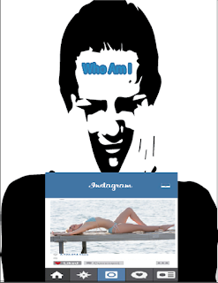
My stance is that people, especially women, do not express who they truly are on the internet. The text successfully reflects this. "Who am I trying to be? and Who am I?" emphasize that the image isn't a clear representation of who she is. She is confused as to why she has to prove herself to others. The girl in the image is crying and colored black to show her sadness. 
-From your initial thumbnail sketches to your hand drawn draft- Do you feel you were successful in re-creating your poster idea digitally? If not, do you like the new visual outcome? 
I definitely improved from my initial draft. My first hand drawn draft represented the first digital draft. The composition is a bit unclear as there isn't an exact focal point. Thus, I placed the crying girl into the Instagram border.  

-What were the changes you made from your first version to the last version of the poster? Explain why you made those changes?
My first change was placing the woman into the Instagram border rather then having her cover the entire page. This is a more ideal representation of Instagram and and how people express themselves. I also got rid of the girl in the bikini from my first draft. This is because there is no emotions shown from that picture which will make the poster unclear.  
-Looking over your rubric, which category do you think your project is strongest? Explain why. Which category do you feel the least confident? Explain why.
I feel confident about the concept category. My idea is shown clearly by having an Instagram theme. I feel the least confident in the skills and technique category because the overall program was difficult to use and understand.

-What was the most challenging aspect of the project, conceptually? 
Conceptually, getting my idea out was challenging. From my initial thumbnail sketches, my poster has definitely changed. I realized there are many ways to enhance a single idea if you keep making multiple drafts.

-What was most challenging about the project, technically?

 Technically, understanding how to use the program was challenging. It was a completely new program to me so everything was difficult. Such as making the "Who am I" text. I actually followed a step by step tutorial to make this Instagram text.

Tuesday, January 12, 2016

What's my stance?

I think feminism is a great. Ladies, I agree we should all support each other and embrace our womanhood however, after seeing many posts regarding the "free the nipple" movement, I question whether or not some of you actually believe in what you say. I constantly see on social media teenage girls posting images of themselves half naked. I agree that a woman's body belongs to themselves and not for a man but face it... you're pictures are considered pornography! What gets me more frustrated is that some girls pose in certain ways so that their butt or boobs look more appealing. Is feminism a cover up for attention seekers? Very debatable. Cover up ladies, at least for the camera!

http://mic.com/articles/124146/here-s-what-the-free-the-nipple-movement-has-really-accomplished#.FlBqeeJzW
http://www.heraldsun.com.au/rendezview/free-the-nipple-campaign-is-not-empowering-for-women/news-story/cddc69e61100b512758adc8939808aa4

Another current issue I am interested in is college tuition. I think the price of going to college is ridiculous and I'm not sure why nothing is done to change that. As a senior heading to college, I really have to factor in money when choosing a school. No one should have to go through paying back a ton of loans!

http://www.washingtonmonthly.com/magazine/septemberoctober_2011/features/administrators_ate_my_tuition031641.php?page=all
http://www.forbes.com/sites/steveodland/2012/03/24/college-costs-are-soaring/#2715e4857a0b2e4c4821641b

Wednesday, December 23, 2015

Self Symbol GIF


My concept is craziness. Many of my friends would describe me as crazy so that is what I conveyed through my gif. I arrived at this idea because I wanted to create something that shows how I can change through my features. Since my hair is one of my most obvious, I decided to make it transform. My images transform from being put together and serious as I have a neat bun and straight face to my bun falling out and getting bigger. In addition, my serious face turned into being brighter and happier. 

My original idea of this gif was more simple. I have made it more complex by adding facial features and highlights to the hair. Also, I definitely enhanced my gif by using multiple colors.  

Monday, November 23, 2015

The Evolution of Fashion


                                                               Final image right above
My concept is the evolution of fashion. Each person on the runway represents a specific time period in history. As you can see, the opacity of each person changes. The more translucent the person is, the less relevant the fashion is in society. The farthest person away represents 1920's fashion and specifically the fashion for "flappers"(a fashionable young woman intent on enjoying herself and flouting conventional standards of behavior). The second woman farthest away represents the elegant fashion in the 1950's. The third woman represents patterns and bold colors in the 1970's and the closest person represents the swimwear fashion in the 2000's. As the years go by, you may notice that woman are wearing less and bolder clothing as a sign of self expression. 
I am happy with my results. While I was able to show the changes of fashion, this project reflected my skills in graphic design. As a beginner I feel like I'm already improving even though things aren't perfect.I am satisfied! 
One of the tools that I used a lot in my project was the clone stamp tool. The original background image included two models already on the runway. At first, I tried to cover one of the models with the swimwear model I pasted in. You can see this above in photo #2. To get rid of the model from the background, I used the clone stamp tool. By doing so, I cloned the color of the runway, and erased the model. As the upper body was still visible, I cloned the audience as well as the grey/black above them so the background didn't look blank. Then I used the stone clamp tool again to make the empty space above the audience black. This helped emphasize the models and made them bolder. In addition, the original background image had a logo where the models were coming out from. I wanted to get rid of this so I used the clone stamp tool to make that entire space white. This also made the models look bolder.